The first time I heard of Charli XCX was back in 2014. “The Fault in Our Stars,” a New York Times best-selling novel turned blockbuster movie, had just hit theaters. One of its standout moments was the infectious track “Boom Clap,” an earworm that perfectly underscored the characters’ wanderings through the streets of Amsterdam. Although Charli XCX continued to release great music, she seemed to fade from the mainstream spotlight, never quite topping the charts. As she aptly describes in a lyric from her latest album: “I’m famous but not quite, one foot in a normal life.”
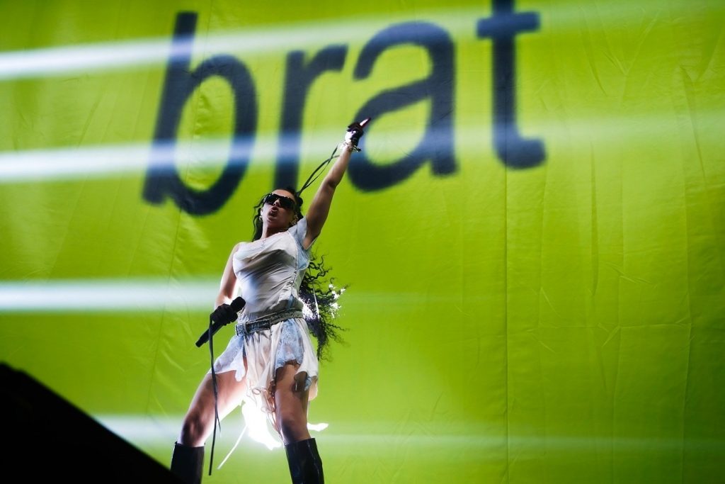
That all changed with the release of “Brat,” her most recent album. In the ever-evolving world of pop, where artists are constantly trying to stand out, Charli XCX has always managed to forge her own path. Known for her innovative music and visuals, she’s never shied away from pushing boundaries. “Brat,” with its deliberately “ugly” album artwork, is a perfect example of how Charli uses unconventional aesthetics to create buzz and connect with her audience in a way that only she can.
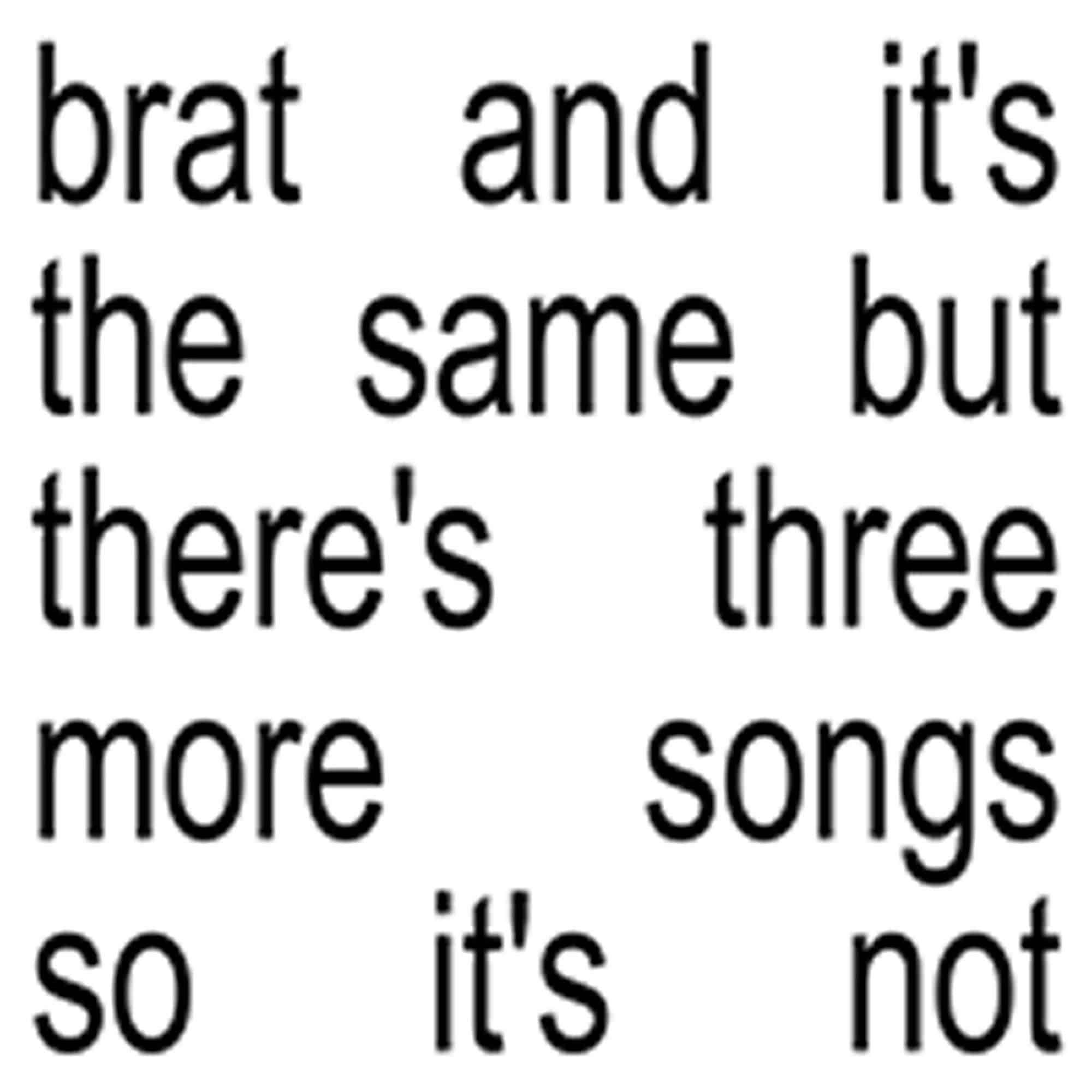
The first thing that strikes you about the “Brat” album cover is its jarring, almost chaotic design. In an era where sleek, polished visuals are the norm, Charli XCX has embraced an aesthetic that can only be described as “ugly.” But this is not a result of poor design; it’s a deliberate choice.
By opting for a design that clashes with conventional beauty standards, Charli is making a bold statement. The artwork, which features distorted images, clashing colors, and seemingly random elements, forces the viewer to reconsider what album art can be. It’s a direct challenge to the idea that art must be conventionally attractive to be impactful.

In marketing, disruption is a powerful tool. It’s about breaking the mold and doing something so unexpected that it captures attention. The “Brat” album cover does exactly that. In a sea of album covers that blend together with their glossy production and cohesive color schemes, Charli’s choice to embrace the “ugly” disrupts the status quo.
This disruption extends beyond just the visual. It challenges the listener’s expectations of what pop music and its accompanying imagery should be. By doing so, Charli creates a dialogue around her work, inviting both fans and critics to engage with the album on a deeper level.
Charli XCX’s decision to embrace an “ugly” aesthetic is also a reflection of her commitment to authenticity and self-expression. In a world where image is often curated to perfection, Charli’s album art is refreshingly raw and honest. It mirrors the themes of rebellion and individuality that permeate her music.
This authenticity resonates with her fanbase, who value Charli for her fearless approach to creativity. By rejecting the polished, commercialized imagery that dominates pop culture, Charli reinforces her identity as an artist who isn’t afraid to be herself, flaws and all.
There’s no denying that controversy sells, and Charli XCX is well aware of this. The “Brat” album cover, with its divisive aesthetic, has sparked discussions and debates online. Some love it, some hate it, but everyone is talking about it—and that’s precisely the point.
By creating a piece of art that polarizes opinion, Charli ensures that her album is at the forefront of cultural conversations. This kind of publicity is invaluable in the crowded music industry, where getting noticed is often half the battle.
Charli XCX has long been associated with the hyperpop genre, which itself is characterized by a maximalist, DIY aesthetic. The “Brat” album cover aligns perfectly with these movements, which celebrate imperfection, excess, and a sense of playfulness.
The artwork’s chaotic, “ugly” design can be seen as a visual representation of hyperpop’s sonic landscape—loud, abrasive, and unapologetically experimental. By embracing this style, Charli not only solidifies her place within the hyperpop community but also elevates the genre to new heights.
Finally, Charli XCX’s “Brat” album cover is a masterclass in leveraging social media and meme culture. The bizarre and unconventional nature of the artwork makes it perfect fodder for memes, which in turn, drives organic online promotion.
Fans and detractors alike have taken to social media to share their thoughts on the artwork, often accompanied by humorous commentary or edits. This kind of viral content is priceless in today’s digital landscape, where word-of-mouth and social sharing can make or break a release.
Charli XCX’s “Brat” album artwork may not be traditionally beautiful, but it is undeniably effective. By embracing an “ugly” aesthetic, Charli disrupts the norm, sparks conversation, and aligns herself with the DIY and hyperpop movements. It’s a bold, authentic expression of her artistic identity that resonates deeply with her audience.
In a world where visual perfection is often equated with success, Charli XCX reminds us that sometimes, it’s the flaws and imperfections that make something truly memorable. The “Brat” album cover is not just a piece of art—it’s a marketing masterstroke.
Looking for an agency to handle your Thailand and Southeast Asia marketing needs? Reach out to us at MOST 2414.
Listen to Charli XCX’s “Brat” and have a brat summer.

 Dakota
1015/29 Sukhumvit 71 Road,
Watthana, Bangkok 10110
©2025, MOST 2414 Co., Ltd. • VAT No. 0105558155913 • Terms & Conditions • Privacy Policy • PDPA • Sitemap
| Cookie | Duration | Description |
|---|---|---|
| cookielawinfo-checbox-analytics | 11 months | This cookie is set by GDPR Cookie Consent plugin. The cookie is used to store the user consent for the cookies in the category "Analytics". |
| cookielawinfo-checbox-functional | 11 months | The cookie is set by GDPR cookie consent to record the user consent for the cookies in the category "Functional". |
| cookielawinfo-checbox-others | 11 months | This cookie is set by GDPR Cookie Consent plugin. The cookie is used to store the user consent for the cookies in the category "Other. |
| cookielawinfo-checkbox-necessary | 11 months | This cookie is set by GDPR Cookie Consent plugin. The cookies is used to store the user consent for the cookies in the category "Necessary". |
| cookielawinfo-checkbox-performance | 11 months | This cookie is set by GDPR Cookie Consent plugin. The cookie is used to store the user consent for the cookies in the category "Performance". |
| viewed_cookie_policy | 11 months | The cookie is set by the GDPR Cookie Consent plugin and is used to store whether or not user has consented to the use of cookies. It does not store any personal data. |